FlyUX
iOS app for a fictional start-up airline that wants to create an online experience that is fast, easy, and intuitive. The focus was on the booking process.
This was my final project for the UX Design Institute which took me through the end to end design process starting with research to understand user pain points in the industry and also identify trends that work well. The end goal for the project was to design a clickable prototype, along with a detailed set of wireframes that could be passed on to an engineering team to build.
Client
UX Design Institute
Role
Researcher, UX/UI Designer
Tools
Sketch, Miro, Reflector, Google Meet
Summary
User Problem
Budget airlines are focused on increasing revenue at the cost of their customer's experience. Users are looking for a simple process that allows them to meet their goal of booking a flight.
Business Problem
FlyUX is a new budget airline that has yet to come to market and wants to create a booking process experience that is quick and intuitive by proofing their concept.
The Solution
The solution is a proof of concept mobile application that has been created using the ideal UX process utilizing research techniques with real-world users to inform design decisions.
01 // Research
My research first centered around the competition space in order to paint a picture of the current state of the industry. I was specifically interested in design conventions that were being followed, as well as what competitors might be doing that isn't so great. I identified four apps, audited the areas that applied to the design task, and reviewed each competitor by notating screenshots using usability heuristics.
Key Insights
- The use of geolocation to set the users nearest airport for departure reduces the amount of steps a user must take.
- Popups and attempts to sell upgrades prior to the user settling into the payment sequence were distracting.
- Progress bars/breadcrumbs help to orient the experience.
- Lack of navigation options (back button) made it difficult to return to a previous step.
- When used properly, native keyboards & number pads allowed the input of information easily.
Since FlyUX is a new player in the budget airline game, it was important to me to gather insights into the participant's profile including, location and occupation as well as airline app usage and recent travel history. This was accomplished by screening and recruiting for a total of 5 participants for a 30 minute interview.
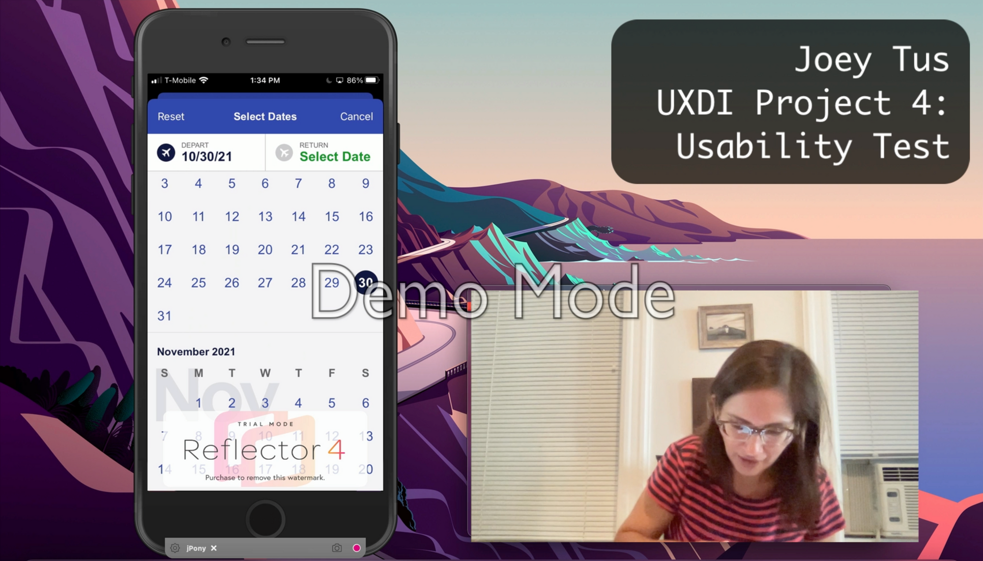
In addition to the interviews, participants were also taken though a usability test of 2 competitors. The test was performed remotely using screen mirroring and recording software. The user was given a set task for each product including travel criteria to use for the booking process. The aim of the test was to further identify any areas for improvement and any pain points the user encountered.
Key Insights
- Lack of navigational components left users unclear on how to select flights.
- Prices on flights were not the true price after taxes and upgrades.
- When attempting to select a direct flight, it was not clear where this information lived and caused the time to decision to increase.
- After flights had been selected and a user reviewed their flight summaries, they were surprised to see that the flights they had selected included layovers. This caused frustration and forced users to return to their flight selections and attempt to find direct flights, solidifying the notion that the most important information must be presented to the user at the time of selection.
02 // Analysis
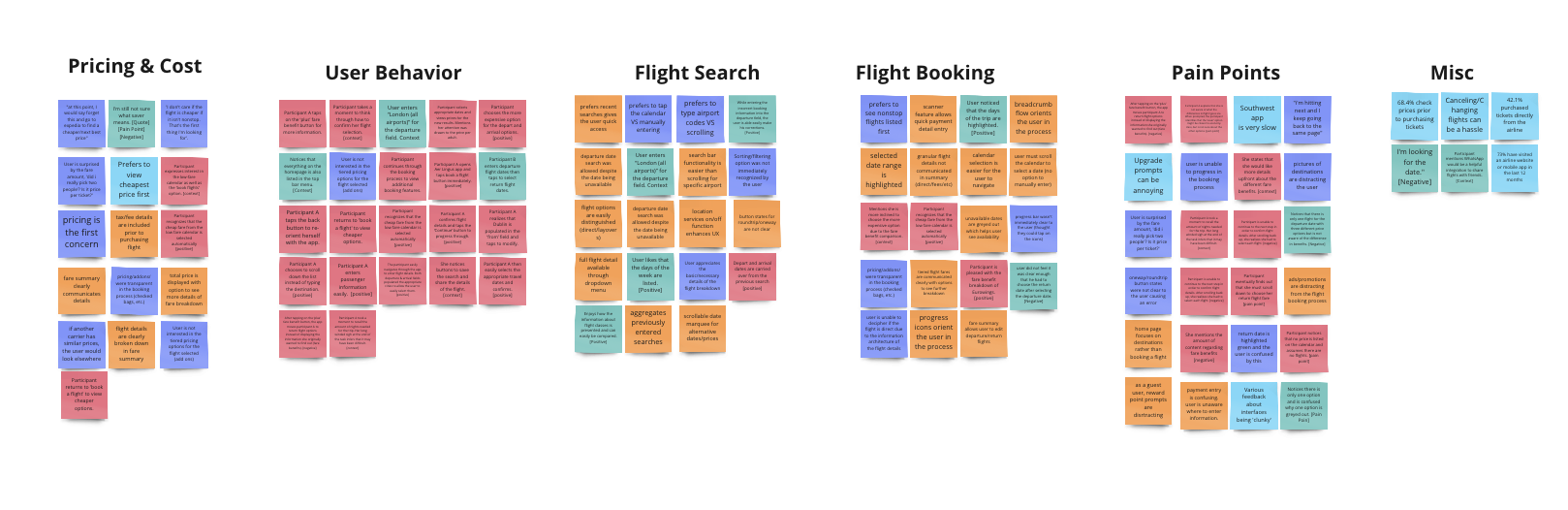
After reviewing the user interviews and usability testing notes, I ended up with a great amount of information to wrangle. Using an affinity diagram, I was able to bring structure to a plethora of qualitative insights. I categorized data over three rounds which allowed me to identify patterns. I began by sorting the notes by grouping them into categories.
Building on the insights we've gathered so far, I developed more structure on the analysis of the research data by creating a customer journey map by defining the high-level steps in a customer journey from visiting the app all the way through to flight summary & payment. I defined user goals, behaviors, positive and negative interactions that allowed me to visualize an emotional state for each step of the journey.
How might we?
Given the vast volume of data, I wanted to emphasize certain primary pain points. As a result, I defined "How might we" statements to concentrate on.
- How might we present users with the information they need when selecting flights?
- How might we allow users to quickly begin the flight booking process?
- How might we simplify the process for users by anticipating their needs?
03 // Concept Design
After defining the goals, surfacing pain points, and areas of opportunity; I created the user flow that incorporates fixes for the issues I uncovered during research to understand how users will interact with my designs.
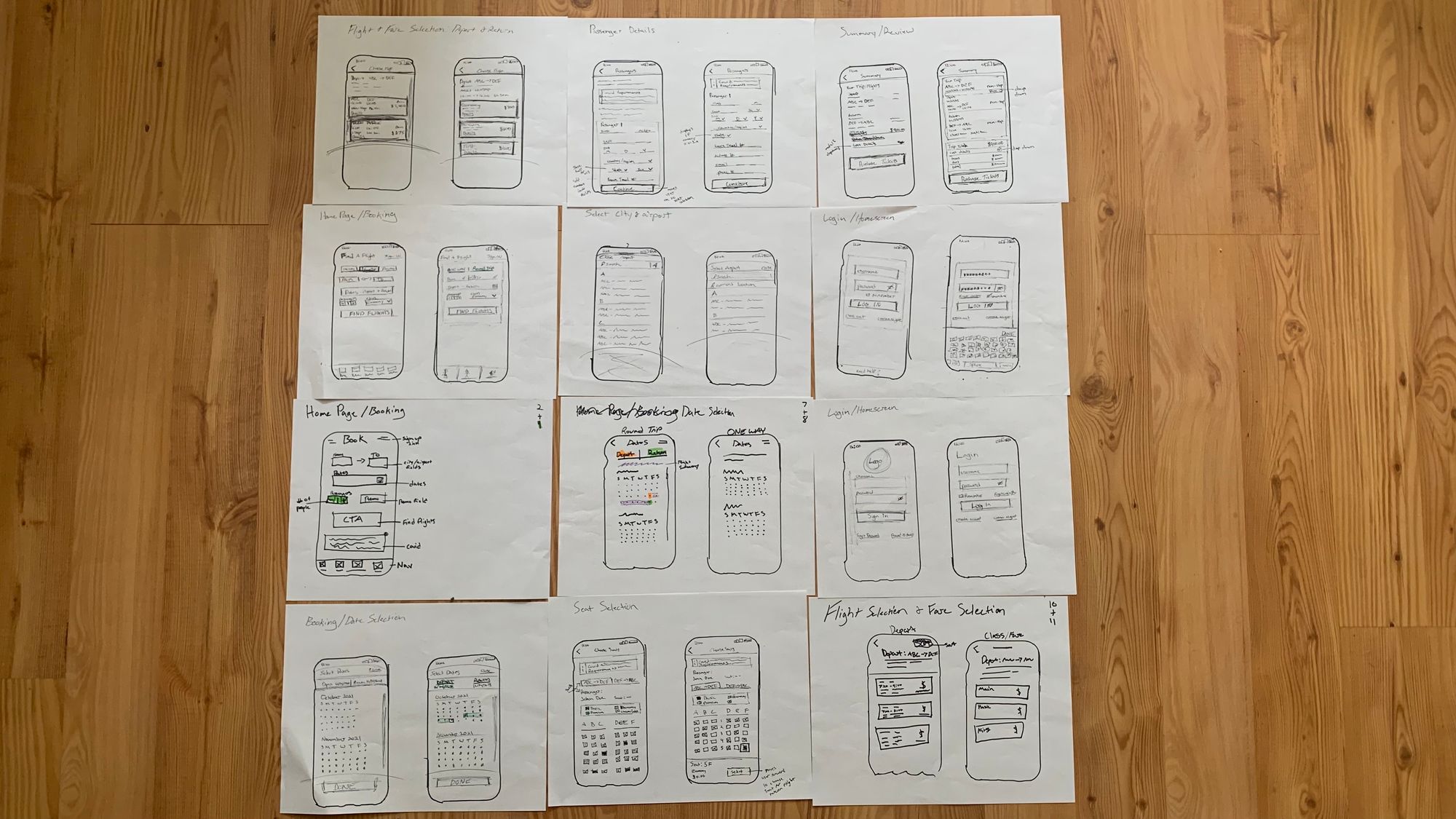
With the user flow defined, I started to capture my ideas by sketching low-fidelity screens using a pen, marker, and paper. This helped me to have my ideas in a tangible format and allowed me to review them before moving into a digital format.
Once I had laid a structural foundation for the app, I started to add more details by creating mid-fidelity wireframes. I included elements that directly address user goals, pain points, and frustrations that surfaced from my research all while incorporating common design patterns seen in other airline apps from the competitive analysis. I also included native iOS components (keyboard, number pad, etc.) to help optimize development time.


My research first centered around the competition space in order to understand how other apps are handling the booking process. I was specifically interested in design conventions that were being followed, as well as what competitors might be doing that isn't so great. I identified four apps, audited the areas that apply to the design task, and reviewed each competitor by notating screenshots using usability heuristics.
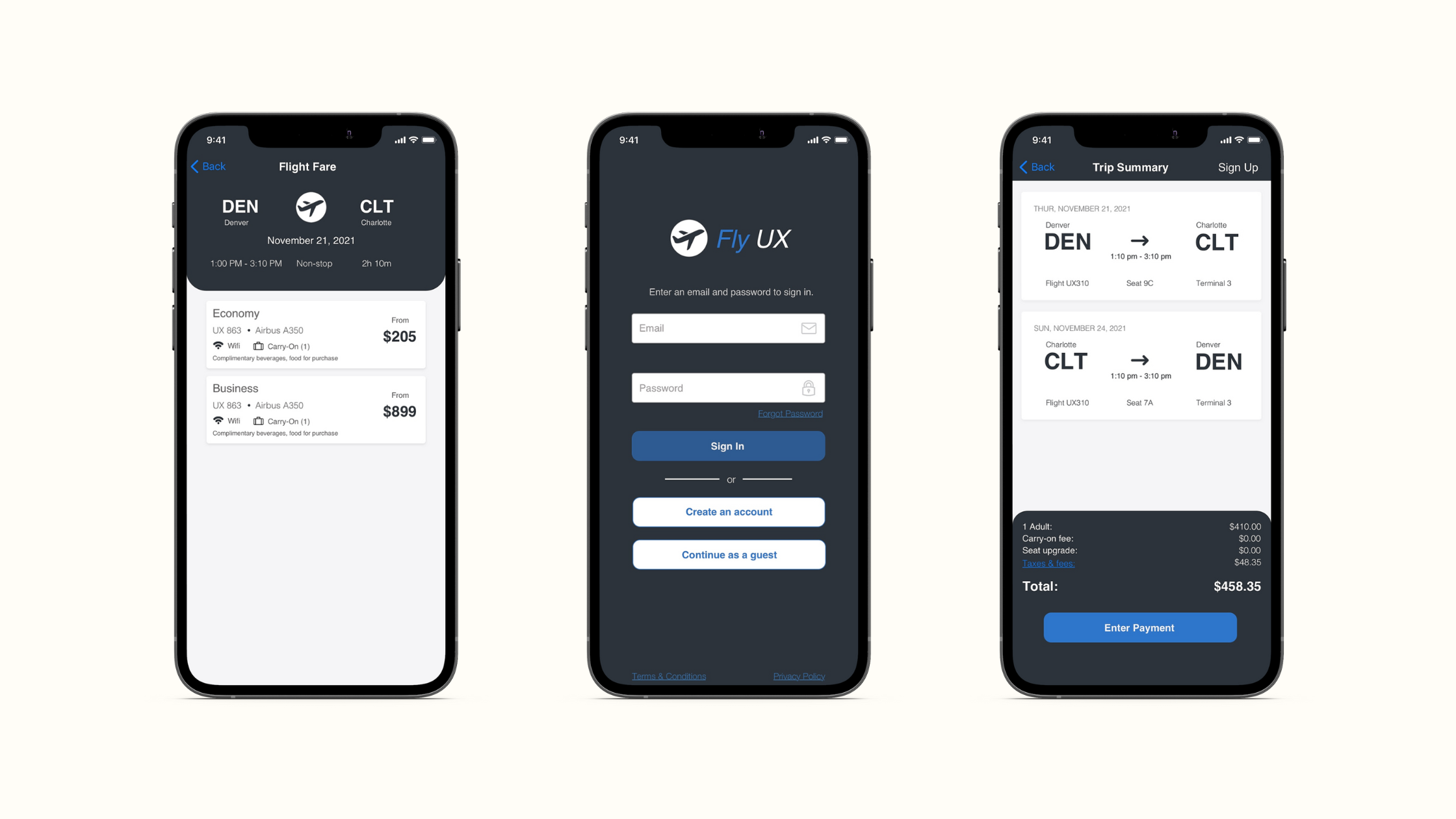
View PrototypeFollowing the prototype build, I annotated each screen to define interactive elements and how fields behave when a user is moving throughout the application. It was important for me to be as detailed as possible to take away any guesswork. This is where I defined all of the extra details that a developer would need to build the product accurately with minimal confusion in terms of functionality.
Real World Practice
FlyUX is a fictional product and this project focused solely on the UX process, there weren't any business needs or stakeholders to consider. In real-world practice, there would be many more considerations and constraints to account for. This concept project allowed me to work on an ideal UX process, but that process isn't always so linear when creating a real feasible, viable, and desirable product or solution.
More Usability Testing
Due to time constraints, I wasn't able to test my prototype with users. If I had to go back, I would prioritize another round of testing prior to developer handoff. This would allow me to solidify or iterate on design decisions and lead to a more sound solution.
Visual Design
Another thing that was made clear during this process if the importance of atomic design principles when we're thinking of high-fidelity wireframes. The wireframes and prototype submitted for this course are mid-fidelity at best. I wish there was more of a focus on UI design in this course, I would have spent more time utilizing atomic design, creating brand guidelines and components to ensure a streamlined design process that is accessible.
Final Thoughts
Overall, I really enjoyed working on this project, it was a great experience to apply what I learned from the course in my current role. Coming from a product management background, I was comfortable with the research portion and particularly enjoyed running interviews and usability testing. I quickly learned the importance of research in the UX design process, which is something that hasn't been emphasized in my current organization. This course allowed me to apply that lesson and use it in my day to day as an advocate for research. While I learned a lot and the project went well, there were a few things that I would improve on if I had the chance to do it again.